01. Defining Problem
A B2B platform targeting Fortune 1000 companies, with a bulk of technology and financial institutes.
The previous setup allowed a unique domain name for each client, making it a nightmare for the Account Managers as well as users to remember rather long and complicated URLs. There was a high rate of misspelt URL and frustrated users would continuously write into Customer Service or leave the platform altogether, resulting in effecting the revenue. The branding was sloppy with no consistency. Site looked and felt outdated, with little to no education material for the users.
With the ambitious goal of adding more merchant partners, getting more companies onboard and increasing traffic – there was a desperate need to enhance the platform and user experience.
02. Exploring Solution
The first step was to consolidate all different URLs into one universal domain. This is how Perks at Work originated and became the standard of our eCommerce platform.
Second came the branding and setting up style guidelines. This was crucial to address upfront in order to communicate with our clients / users as we migrate them all to the new, single domain while still maintaining client’s customization and co-branding.
I lead the initiative working with other designers and an external marketing firm. We went through extensive 2 weeks sprint, a lot of ideas were sketched and presented. We eventually decided on the following to kick things off.


03. Design Process
After settling on the branding, we moved on to the actual web platform. In order to make it a success, a mere new logo and style guide wouldn’t cut it. The whole platform will have to evolve to meet user demands and accommodate enterprise goals. This is where we initiated a complete overhaul of the platform.
Since the product comprises a lot of different subcategories and sections, I was in charge of creating an overall look n feel and user experience from when a user first comes to the site, browse offers, and makes a purchase.

Team Setup
Designers
Engineers
Account Managers
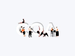
Market Research
While researching the market and competitors, it became clear that just having an eCommerce site with good offers wasn’t going to set up apart. We took a more holistic approach, incorporated our culture into our products, and developed tools and features to help facilitate a better discount program with supporting mobile apps.
Prototyping
User experience map from once you sign up/login, to browsing the site and different categories, to completing your transaction.

Login/Sign Up Page
Gateway to our platform and creating the first impression. This page played a vital role in migrating our existing users and gaining new ones. Utilizing the space to educate our users about our company, credentials, and other services we offer to get you started.

PAW Marketplace
The next step was to create landing pages once a user logs in. This is where we show how our website works, all the discounts we have to offer, different programs we have to save even more, exclusives for specific companies, and other intuitive widgets to keep our users engaged.
I created different experiences for a different set of users: First Time Users (FTUs), Casual Buyers (less than 5 transactions in a year), and Loyal (consistent shoppers). All pose a different set of challenges, which through regular iterations and testing – we were able to create the optimum user experience.


User Transactions Flow
We created two different flows a user can make a transaction on our platform: OneCart and OutPath.
With OneCart, we have a list of merchants we host on our platform with their complete catalog, which means a user does not have to leave the site to make a transaction. For example, they can go through Best Buy’s complete product list and purchase any product without leaving Perks at Work. Tracking is easier and we award the loyalty points much quicker.

With OutPath, you can search for thousands of your favorite merchants on our platform, get the details on the offer display pages, click through the link, and shop on the merchant’s site. We track your transaction and award loyalty points based on the dollar spent.

Email Campaigns
In order to create a successful product, a new and apt email campaign was also needed to go along. This is where I connected and worked directly with the CRM teams to create email templates and guidelines for the new batch of emails to follow. The inclusivity of all the details helped the teams to execute any email broadcast easy and consistent with our branding.


Mobile App
No eCommerce experience is complete without a mobile presence. The website itself is designed to cater to responsiveness but also designed a stand-alone mobile app for Perks at Work.
The mobile app intentionally has a limited scope, compared to the platform, and focuses primarily on displaying curated content by user interests.


04. The Impact
With new branding, overhauled eCommerce platform with supporting products and mobile apps, we were able to build stronger relationships with existing clients and were able to get companies like Facebook, Tesla, Google, etc on board. The new and professional look helped us build credibility, improve user experience, and enhance our interfaces.
The introduction of the new style guide helped to build interfaces quickly, maintaining consistency, and providing guidelines for engineers to implement the mockups more efficiently.